With the surplus of website templates available online, you’d be forgiven for thinking we’ve “solved” website design. Indeed, for some uses, we have. But if you want to create attention-grabbing, powerful websites, you’ll need to create the layout yourself. By following some fundamental design principles, you can create beautiful websites.
Paragraphs, logos, navigation bars and colors are all design elements that need to be harmonized according to the basic principles of design. In web design, much of page design is about budgeting and directing user attention towards the elements we want them to focus on. By drawing from this visual vocabulary, we can gently push visitors towards the user interactions we want most. Practice these design principles below while working with wireframes or prototypes to create pleasing, attractive designs.
Contrast
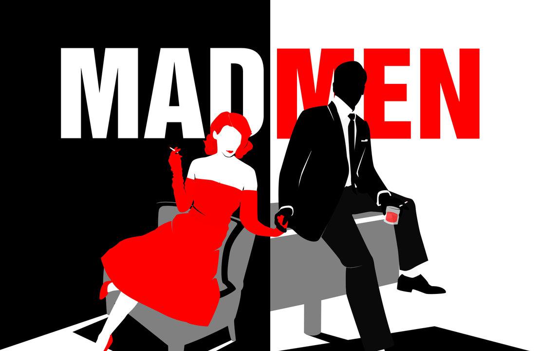
Juxtaposing dissimilar shapes, images and colors creates tension, which can make a design more engaging. We call this contrast, and it helps build interest in your material. It can also help viewers navigate between sections of websites, by quickly sorting information into different categories. You see simple contrast in the difference between headline and body text, or in navigation versus body copy.
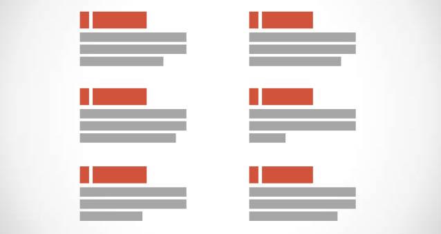
Repetition
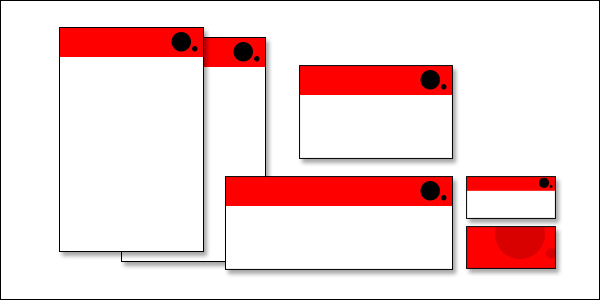
Repetition and variations create organization and rhythm within your design. This can guide the viewer through your website, helping them find the information they’re looking for. Repeating units create a strong sense of visual unity, with shared shapes and colors helping the viewer understand the relationship between elements. By subverting this repetition, you create a focal point in your design that grabs the viewer’s attention. For example, a change in color or shape in header design helps to delineate separate content.
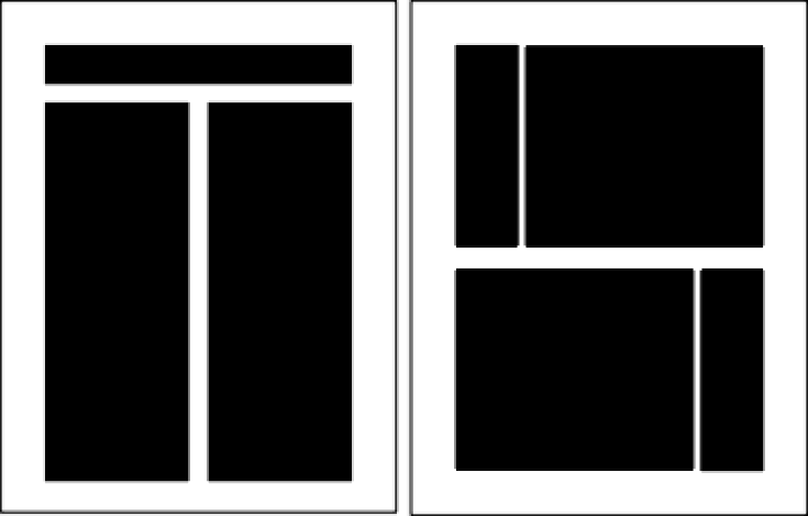
Alignment
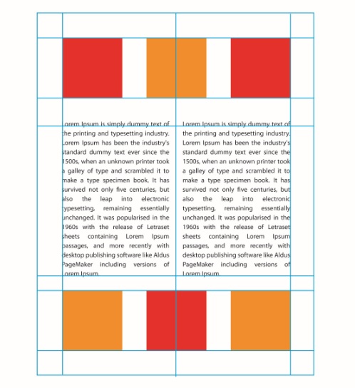
Alignment is one of the most basic elements of design, and it’s about lining shapes and forms up with one another. The most basic version of alignment would be a row of blocks lined up along the same horizontal line. By aligning design elements, we connect them together, creating a visual similarity that helps readers mental “chunk” our website design. By breaking this alignment, we indicate a change or difference, creating distinct sections of web pages. We can also play with user expectations, aligning content “incorrectly” to create tension in our designs.
Proximity & Space
Proximity describes how close or far apart objects on a page are. If objects are too far apart, they’ll feel disconnected and disjointed. Objects that are too close together will compete for attention and reduce legibility. A comfortable spacing will indicate the right degree of connection without making it hard to focus on what the viewer is hoping to find. If you’re trying to group design elements, space them so that their relationships are conveyed by how close together they are.
Sometimes called negative or white space, the space left between design elements is as important as design elements themselves. The white space is what allows us to organize design elements into readable patterns. Without white space, or with too little white space, the page will appear cluttered, jammed or overwrought. Find the right distance between design elements by experimenting with wireframes.
Balance & Symmetry
Visual objects have “weight,” which describes how much of a viewer’s attention they draw. It can also describe how much of the page they occupy: larger elements have a larger weight, since they’re easier to see. If one side of your page contains a single, weighty element, you’ll want to balance the design with multiple smaller elements that add up to approximately the same visual weight.
Symmetry is deeply aligned with balance, automatically creating a sense of neatness and order in designs. By using symmetry, you can create harmonious designs. By intentionally breaking symmetry, you can create engaging, dynamic layouts. Little on the web is perfectly symmetrical, but it’s easy to create small areas of symmetry. It’s especially useful when you need to put a lot of small design elements in one place. Creating a symmetrical layout can calm a busy design.
Line & Shape

When we think of web design, we often think primarily about how to organize text. Lines and colors are just important in text-heavy designs however. A good use of line and shape and organize information while making it pleasant to behold. Look at the pages of a magazine, and you’ll see line and shape used to its fullest extent. Colored backgrounds are used to highlight text and images, while lines are used to guide the reader through non-traditional page layouts. We can follow the same principles in web design, using line and shape to aid our viewers’ in parsing our content.
Lines can also be created subliminally by organizing design elements carefully. When people discuss the “direction” of a photography or painting and how it guides the viewer’s eye, this is one of the elements their discussing If you line up a number of attention grabbing elements in a diagonal shape, that gives a different impact that a straight horizontal alignment. This subconscious recognition of shape helps to guide a viewer’s attention throughout your site.
Color & Value
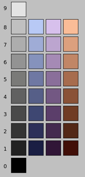
Lines, shapes and text all have color associated with them, and careful use of colored elements is the core of basic design principles. Color can be used to highlight specific design elements, or group together otherwise disconnected items. We often talk about color schemes in design, and as important as choosing harmonious colors can be, using those colors correctly is even more important. Draw inspiration here from your own visual aesthetic as well as other successful websites whose design you appreciate.
Outside of hue, which describes the name of the color, we can discuss value. Value describes the perceived lightness of a color: high value colors are light, while low-value colors are darker. It’s not saturation, but it has a similar impact on designs. In general, you’ll want to avoid using multiple high value colors, as this is both exhausting to look at and hard to parse visually. It’s like trying to read Proust during a parade.. Use one or two high value colors for contrast, and allow the other colors to be more muted.
Conclusion
If you look online, you’ll find templates for everything from full websites to elements like contact form templates and shopping carts. As useful as these tools are for creating quick, “standard” designs, if you want to push the envelope, you’ll need to rely on basic design principles to attract the attention of your visitors.