When building a blog or website using the WordPress CMS, you need to understand the importance of having a great design before applying its best practices.
A web design is not just something that would look good on your website. The design should create a seamless experience by delivering content to your readers in the most stylish way possible without compromising its loading time.
More importantly, and in line with the algorithm changes made by Google with regard to mobile search, your web design should adapt to the device where your site will be viewed, whether it’s from a desktop or a smartphone.
To make your site user- and SEO-friendly, you need to switch to a responsive web design. This allows you to optimize your website appearance depending on which device users access your site or blog. Therefore, even when viewed using a phone with a small screen resolution, your web will look and load great regardless.
If you’re still using a static theme for your WordPress blog or site, consider adapting to these free responsive themes below to provide your visitors with the best possible viewing experience of your site.
Groovy
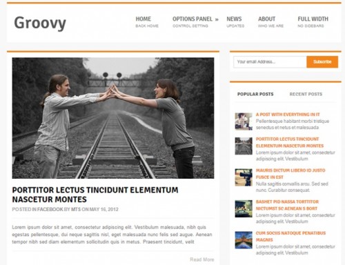
This responsive WordPress theme makes excellent use of white space with thick lines to separate different elements and sections in the page. Includes an email subscription signup, search bar, and popular and most recent posts widgets on the sidebar. If you profit from your website using ads, the theme’s Ad Management allows you to control when and how your ads will appear on your page to maximize conversion. Click here!
Nautilus
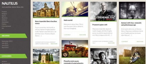
The masonry framework of this responsive theme lets you design your blog posts so that each appears like cards with the featured image and a snippet of the text – perfect for photographer or foodie bloggers. The theme also has a options menu that lets you customize the theme to fit your branding, along with the usual features (widgetized sidebar, customer menu, etc.). Click here to download!
TechZone
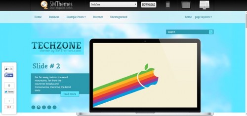
This responsive WordPress theme has a unique slider feature above the fold, allowing you to showcase your images and web copy in the most attractive way possible. While TechZone is geared towards small business, entrepreneurs, and technology industries, this feature-rich theme (WooCommerce integration, dynamic pagination, custom sidebars, SEO optimized, and shortcodes ready, to name a few) has something that will entice site owners out there to check this theme out. Click here to download!
Bloggr
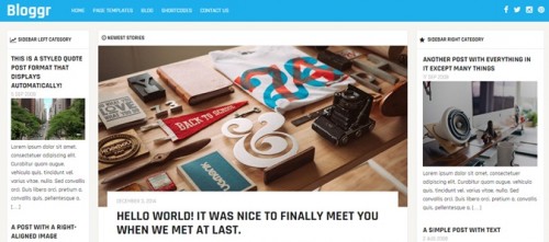
Among all the responsive themes featured here, Bloggr boasts the perfect mix of usability, design, and typography. Its sleek appearance has a magazine feel that is perfect if you’re running an online publication covering different topics. Also, from the small header portion (with tiny but sleek social buttons on the right) to the width size of both sidebars, there is emphasis at the center aisle of the page which is filled up with your latest post and content. Click here to download!
Semicolon
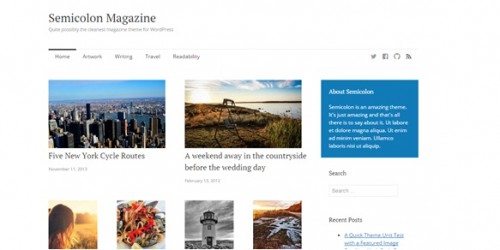
Minimalist makes its way to a responsive WordPress theme. Semicolon takes seemingly polar opposites – the “less is more” approach of minimalism and the compact and dense approach of magazine design – to create a stunning and clean freemium theme. The predominant white space gives the content organized in a grid-like manner room to breathe. Click here to download!
Final thoughts: There are more responsive WordPress magazine themes where these came from. However, consider the five above as your crash course to this type of theme design. Each of the themes here the best current design trends to help create a convenient experience for your visitors when viewing your website.